Although Interior Design & Decoration are the disciplines which deal with the manipulation of spatial volume, the placement of specific elements and furniture, the treatment of surfaces, as well as the overall intention of creating spaces which impart a particular character and atmosphere, it is Interior Styling.
Photo shootings and 3D Renderings are being presented to prospective clients and consumers by the minute, and the need to achieve a powerful impact on the eye of the beholder is what makes styling of the final image an absolute necessity. Styling of course is no stranger to fundamental design theory and employs the Elements and Principles of Design in order to create snapshots and frames that will do honour to the creator’s design intent.
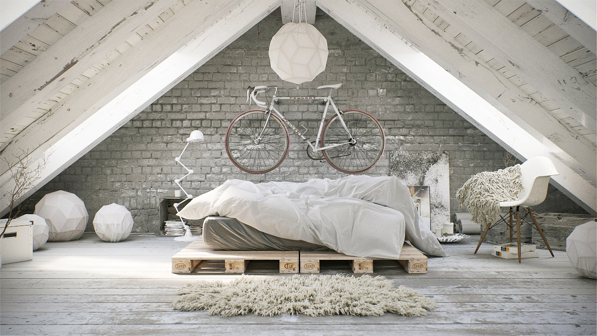
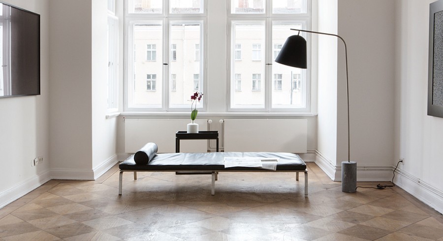
The whole composition of the image follows the “A” principle of styling
Feuerroth Michael. Source: Vrayworld.com
The Triangle or “A” Style.
In setting up the final image, Stylists often structure the composition on the basis of the three points of a triangle. By assembling the pieces and superimposing an imaginary “A” or triangle over them, a frame is created, within which the most meaningful elements of the picture can be placed, so that viewers can focus on an intended story line, which travels across the three cardinal points of the triangle.
The most meaningful elements of the photo are clearly organised in a right-angled triangle.
Source: Wearetriibe.com
Composition of the image begins with the focal point, or otherwise the centre of interest. Careful choice of the focal object will influence the whole image and should carefully be considered to answer the personality and taste of the viewers as well as the purpose of the image. Needless to say that will be the first stop on which the viewers’ eyes will rest and will set the tone of the whole composition. Creativity can dictate using either a statement piece with visual height or weight, or a small group of similar items tightly placed together.
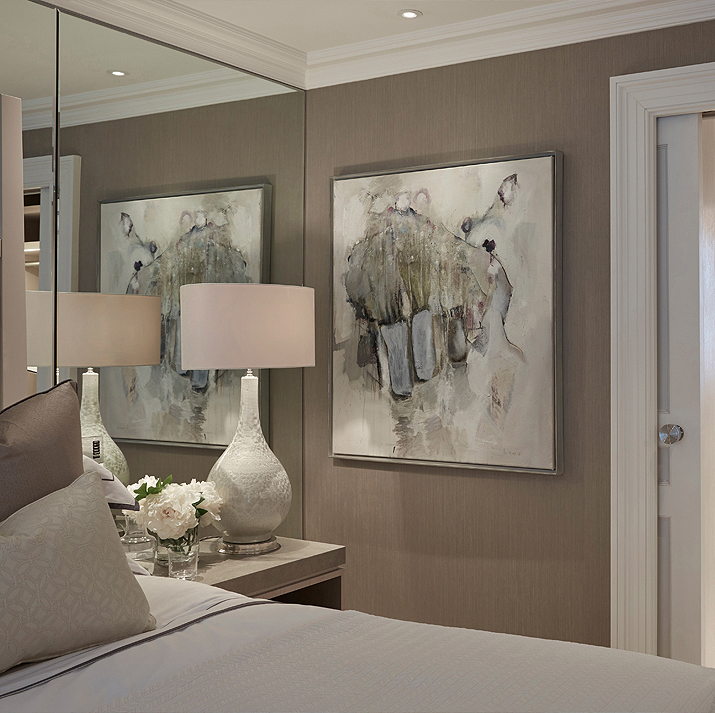
The focal point of the triangular composition is the painting.
Source: Laurahammett.com
The remaining two points of the triangle assume the role of directing the eye across the width and height of the intended frame. Care should be taken to include every element that is necessary for the story being told, while planning for empty negative space between cardinal points. In this way the composition will respect the principles of Harmony and Variety, whereas negative spaces will allow the eye to rest in-between and take in the full intent of the image. Continuity of movement is of paramount importance when deciding on the journey around the items included. Particular care should also be taken to seamlessly close off the composition, by allowing the viewer to arrive smoothly at the beginning of the visual journey.
Linear arrangements can also work beautifully if there is a strong relationship between the objects and some contrast. Although they lack the creativity and dramatic impact of the triangular approach, they can be very helpful in establishing direction to the visual journey. All the properties of the Design Element of Line obviously apply in creating a linear-styled composition.
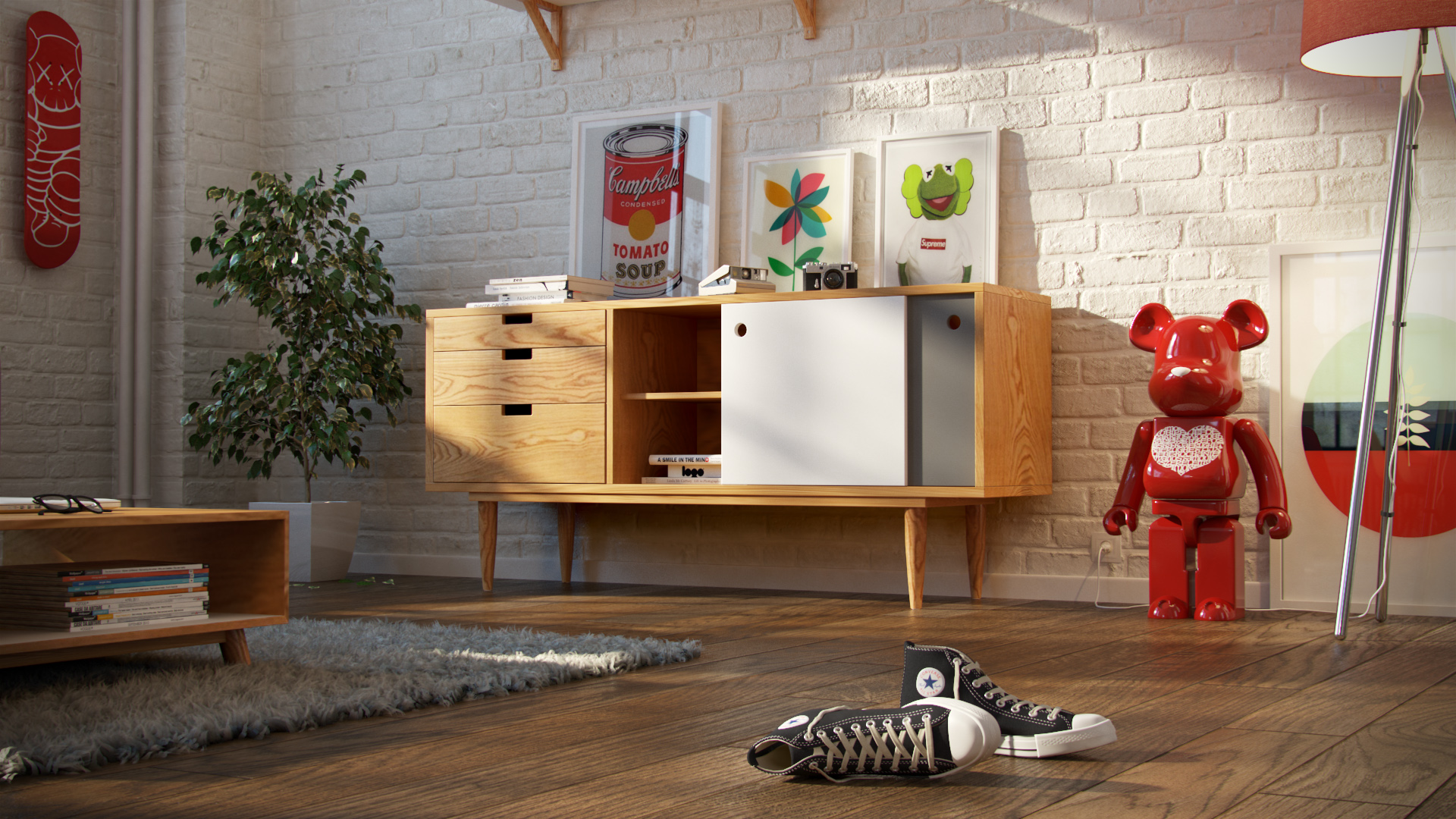
The linear styling of the sideboard emphasises its length.
Apartment NY by Thomas Deffet. Source: Vrayworld.com
In the world of interior design, a vignette is a small picture or composition formed by grouping several objects together in order to create a pleasing spectacle. It can be thought of as a pocket-size table arrangement that tells a story about the homeowner or the commercial brand. A vignette is a harmonious tableau made from a variety of items, rather than a large collection of similar items. Vignettes can easily be reinvented to suit the needs of the creator or end-user. A change of season, a new find, a gift and a special occasion are all good reasons to refashion a display of items and create a whole new story out of more or less the same objects.
TIPS FOR VIGNETTE MAKING.
What makes a vignette different from a mere display of objects on a surface is the “carefully unstudied” nature of the placement. The above-mentioned Styling Principles obviously apply here as well, such as the initial selection of an anchor point and the development of a meaningful composition around it. Avoid even distances between objects at all costs. Pieces spaced evenly over the whole surface lose their connection to one another and may end up looking as if they are set out for a garage sale. Snuggle them up to one another and let some of them touch. For example, deconstruct an excessively tight structure by moving the items of a pair closer together or taking one of them away.
Choosing the appropriate background to the composition is vital. Complicated wallpaper can cause visual chaos behind intricately patterned objects. Dominating colours in a vignette must be carefully considered so that they do not create a visual clash with the existing background colours. Backgrounds reach their full purpose when they succeed in unifying a vignette. Mirrors, for instance, create a dramatic background and bring a vignette to life, by creating depth and perspective, while also intensifying colour and light.
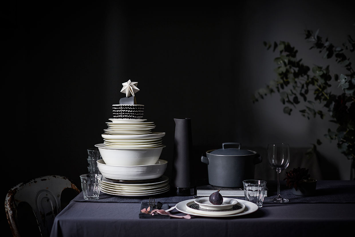
The dark walls create a dramatic backdrop for this triangular composition of kitchenware.
Source: Saniapell.com
Multiple objects of similar height or colour placed at one end of a table or bench create an unbalanced look. An asymmetrical placement needs variety within it and visual connection to the rest of the surface. Balance it with a tall central object, such as a painting or sketch, and a secondary grouping opposite.
Give the members of your vignette a reason to be together. Relate them by colour, texture, theme, shape and pattern. When one or more of these elements is repeated, the eye travels enjoyably around the vignette. The Elements of Rhythm and Variety are at work here.
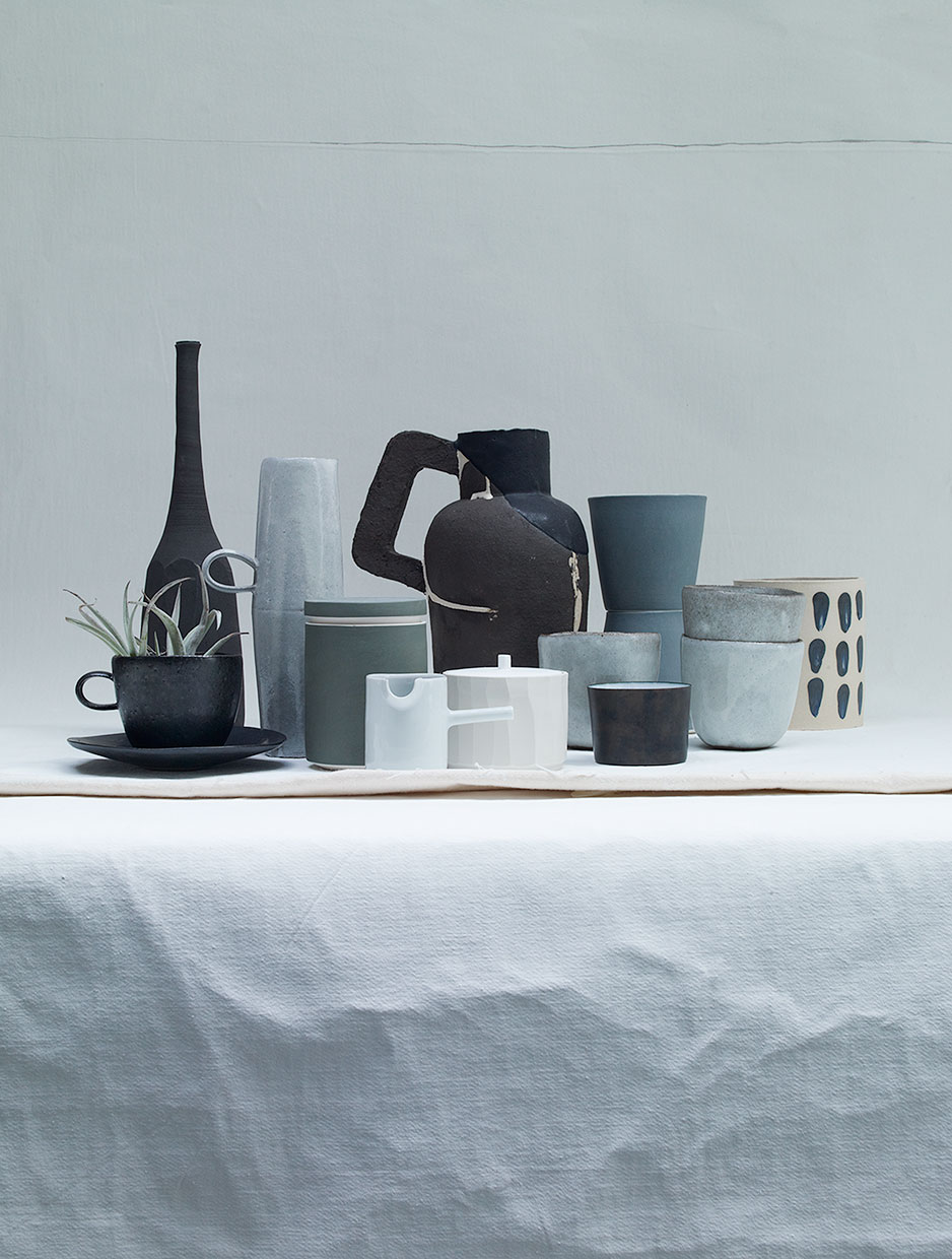
Objects grouped together tightly show much more relation when photographed.
Source: Saniapell.com
Play with contrasts. Think of fresh flowers highlighting the patina of an antique bronze bell, or a delicate woven basket beside a heavy glass bowl.
Keep articles visually linked. Hang a painting or at a height which allows it to relate with the remaining objects of the composition. It will then be a cohesive part of the arrangement.
The surface under your vignette is part of its background, too. An elaborate surface or impressive wood grain calls for simple arrangements and materials atop. Try not to overload a distinctive surface. Keep shapes and colours clean and simple.
If your vignette is on a central table, check it out from all angles and tweak anything that looks awkward.
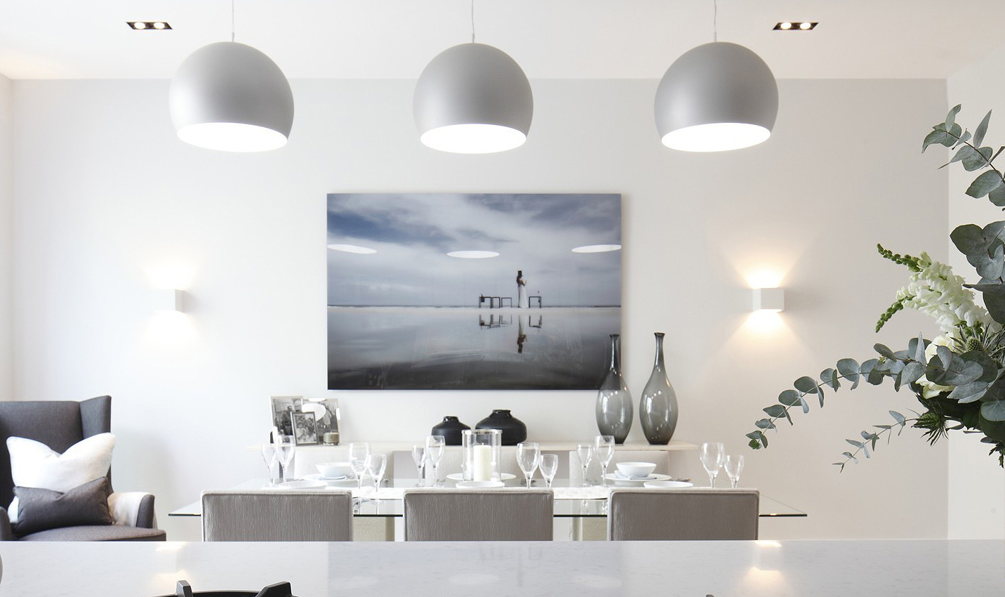
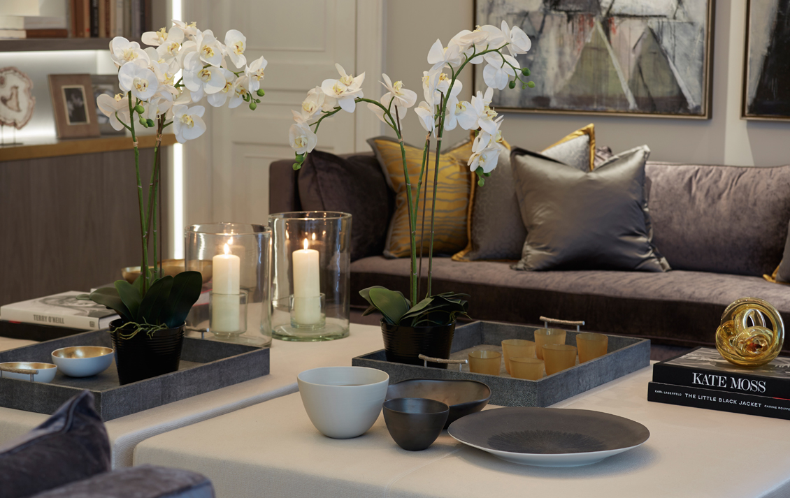
The painting is hung at a height which allows it to relate with the styled surface beneath it.
Source: Laurahammett.com