PROPORTION is expressed in terms of the size relationship of parts to the whole and to one another. It also deals with shapes and forms and their dimensions. When these relationships are pleasing, compositions are characterized as well-proportioned. Proportions are evaluated on the base of ratios, or the comparison of sizes.
Proportion has been a topic of much discussion for centuries, and since there is no one way to determine if the proportions of a design are appropriate, it’s often a matter of trial and error and experience to understand the relationship between objects.
Throughout the centuries that humans have worked towards pleasing proportions, many theories of what is good and pleasing have been put forward. The Golden Mean, also known as the Golden Section, the Golden Ratio and the Golden Rule, provide opportunities to experiment with proportions identified as comfortable and successful by the accomplished Greek engineers and designers.
This article does not intend to analyze the above-mentioned theories and readers are encouraged to look for the extensive bibliography already existing on the subject. The tips that follow are merely practical applications of the principle of proportion in interior design.
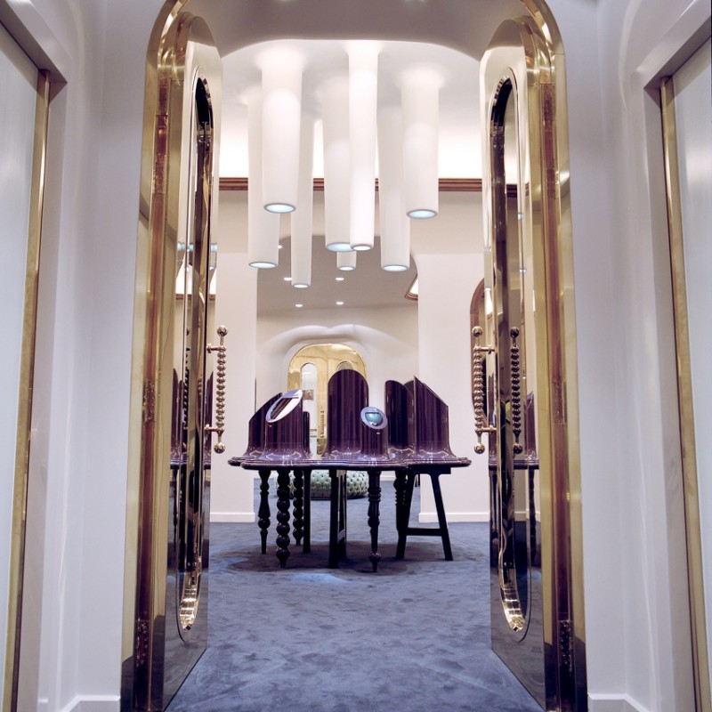
1. In this jewellery shop designed by Jaime Hayon, the exhibition stand is mirrored in the overhanging light fixtures, in a subtle and dramatic game of ratios.
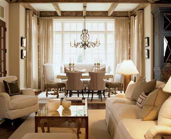
SCALE deals with actual and relative size, as well as visual weight. It is generally categorised as small, or light, medium, large, or heavy, or grand (extra large). In choosing or judging scale, perhaps the most important consideration is human scale. Although large scale is impressive and dramatic in public architecture, and small scale is ideal for children, for the majority of adults scale is most appropriate when it complements and accommodates the average human form. Being most comfortable in such scale defines most architectural and interior design dimensions, such as ceiling heights, chair and sofa seating heights and depths and so on.
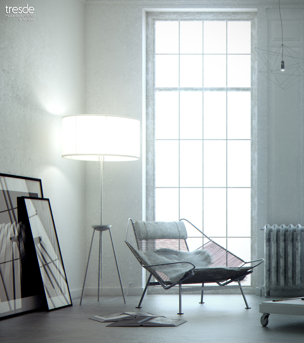
2. Gradation of scale in the furnishings balances the overpowering scale of the ceiling-height window- Design Tresde.
UNITY (HARMONY & VARIETY) is often referred to as the “Master Design Principle”, suggesting a oneness and uniformity, achieved when all the various elements and principles are brought together.
Variety is the absence of monotony and much more. It is a positive influence bringing about vitality, interest and diversity. At the same time, variety without some order or a master plan can become confusing and dissonant.
Harmony is closely related to unity and variety. When creating harmony in a space, we must consider how the unity supports the variety and how the variety reinforces the unity. While this may sound confusing, the major idea is that the elements included to add both variety and unity to the space must be carefully considered in relation to the whole of the design. There must be an underlying idea, element, or commonality that runs through all of the objects and elements used. This common thread may be a style or historical period of design, a colour combination, or a general “feel” brought to the space by each element. It’s the responsibility of each designer to carefully consider the designs they create to assure the making of conscious decisions about each element and principle, and how these are brought together to produce creative, functional, and “whole” designs for clients and designers themselves.
3. Accent colour splashes break up unity and lead the eye to the focal point- Design Kay Douglass.
A cohesive colour scheme or a consistent character and style of the furniture selected constitute unity; background materials, fabrics and accessories that all have a similar or underlying feeling. Use of pattern and ornamentation, colour and value, surface textures smooth or rough, even the coarseness or finesse of the wood grain speak volumes about the designer’s ability to work within the lines of a carefully laid out master plan.
Variety manifests itself in accents, contrasts and focal points, which break up the unity and serve the purpose of engaging dwellers with the space, visually, mentally, physically and psychologically. Tone on tone interiors, for example, make use of accent colour splashes, varied textures and shapes that momentarily discontinue the flow of the space and invite viewers to develop a particular spatiotemporal relationship with a specific area of an interior. Such variations of colour and texture make use of repetition to help move the eyes around a space, allowing for visual excitement within the unity of an overall tone on tone interior.
Every interior should have goals of identity and oneness, yet be varied enough to be interesting. This design statement, set of goals or master plan, should clearly be set forth in both written and graphic form. This way every design item, whether purchased or implemented at once, or over a period of time, will be selected to complement all other design entities specified. It is wise and thoughtful planning that distinguishes fine design from interiors that lack harmony.
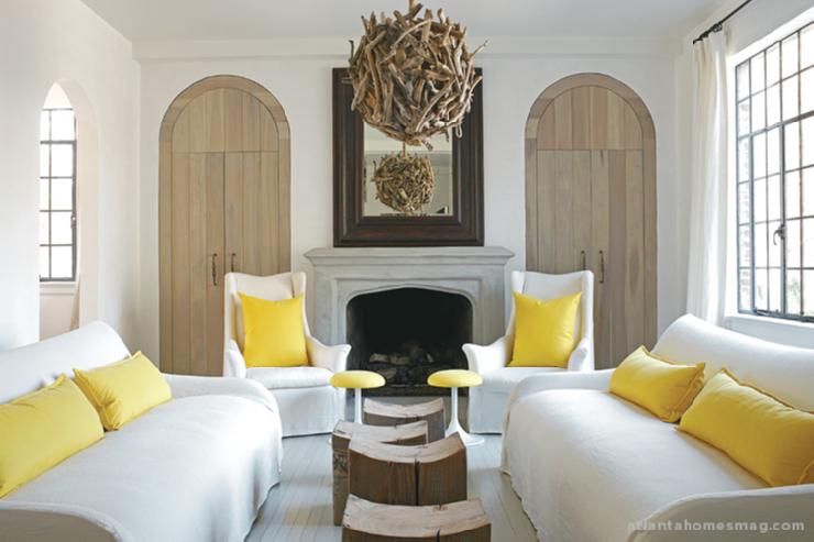
4. Cohesive colour scheme and consistency of character create unity- Design Kelly Wolf Anthony.